Google Sheets is a free, online based spreadsheet with all the features required to create a simple Gantt Chart for small projects, avoiding the use of expensive, dedicated software.
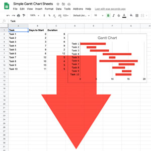
The basis for the Gantt Chart in Google Sheets is to use a stacked bar chart format with two data sets, the days from the start of the project to the start of the task, and the days required for the task. By changing the colour of the first part of the stacked bar then the result looks like the usual task bar in a Gantt Chart. Really neat!
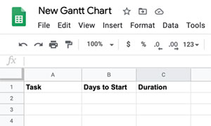
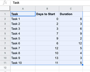
Step 1 - Start the table
Open a new Google Sheet and start the Gantt data table by adding column headers for Tasks, Days to Start & Duration. Format the headers as required.
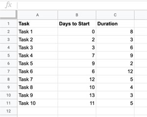
Step 2 - Add the task data to the table
Add the task details, the planned time to start in days from the beginning of the project, and the expected duration of the task in days. The values can be adjusted later as required, and even values (tasks) inserted between others or added on later.
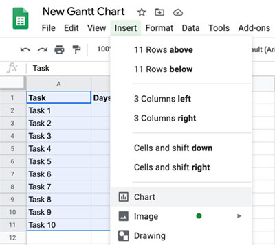
Step 3 - Select all the table data
Click in the top left cell (Task) and drag over the cells to the bottom right, highlighting everything from the headers to the end of the data.
Step 4 - Insert a Stacked Bar Chart
With the table data selected click on the Insert menu item on the top bar, then select Chart to insert a new chart and automatically open the Chart editor. Check that the chart type is set to Stacked bar chart and if not then use the Chart type dropdown to select it.
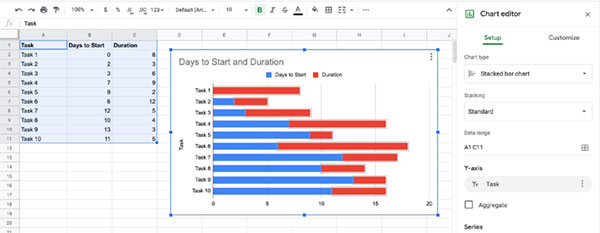
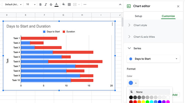
Step 5 - Format the bar colour
Double click any one of the bars of the first data series on the chart (the Days to Start part) which are blue in the example. This will select all the bars in that data set. With them all selected go to the Chart editor on the right hand side and ensure the Customize tab is selected, which it should do automatically. The Series drop down should already be open, as you have selected a series, but if not open it. Then under Format click to open the Color picker and select None. This will make the blue colour disappear leaving just to Duration element of the bar as in a Gantt Chart.
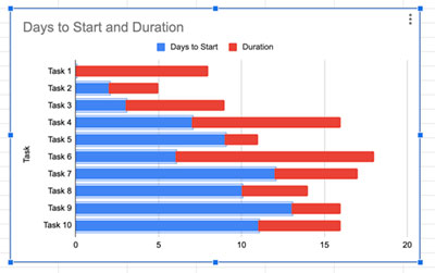
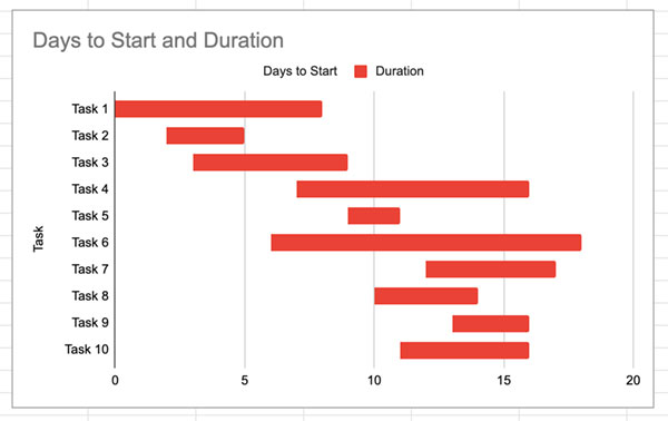
The Gantt Chart can now be further customised as needed by removing or changing the titles, or adjusting the colours etc.
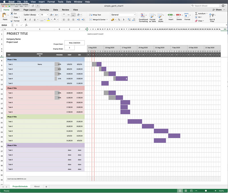
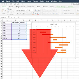
Download the example Simple Gantt Chart for Google Sheets.